Serif or Sans?
When it comes to the typeface you use in your body copy, there are plenty of options and variations to choose from. Even before you go to choose a specific font, you need to make a fundamental decision about what type of font you want to use.
In the broadest sense, font types can be categorised into two categories: serif and sans serif.
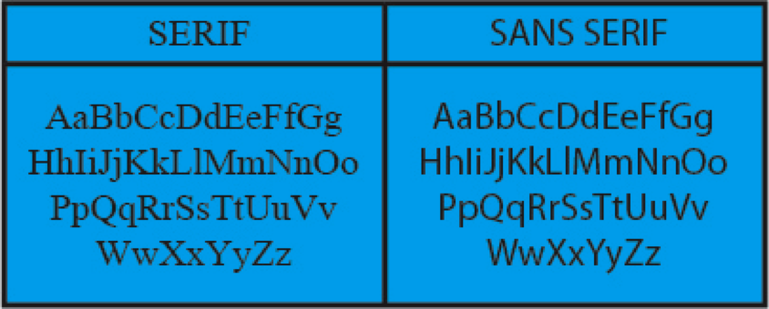
A serif font is characterised by small feet-like things (“serifs”) attached to the end of letters or symbols, and varying thick and thin line strokes (Times New Roman is an example of a popular serif font).
Sans (which literally means “without”) serif fonts, on the other hand, don’t have serifs at the ends of the letters or symbols and the line strokes are always the same strength (Arial is an example of a popular sans serif font).
But which type of font should you use in your copy? In short, it depends…
While empirical research has found that serif fonts are much more comprehensible for readers of printed works, the same doesn’t necessarily hold true for on-screen reading.
Research collated by the British Medical Council in 1926 found that sans serif fonts cause an optical effect called “irradiation”, whereby the spaces between the letters intrude into the letters themselves, causing a type of light vibration that makes reading uncomfortable. The researchers found that the serifs on serif fonts prevent this effect, making serif fonts easier to read.
Another point in favour of serif fonts is that serifs make the individual letters more distinctive, which makes words easier for our brains to quickly recognise and read.
This enhanced comprehension of serif font texts was found to hold true in Wheildon’s empirical study of reading comprehension, where 67% of subjects fully comprehended a text presented to them in serif font, but only 12% fully comprehended a comparable text presented to them in sans serif font.
It seems obvious, then, that serif font texts are easier to read and, therefore, better to use.
But that’s not quite the case.
The findings presented above all refer to body copy in print media, but an important exception must be made for texts presented on screens. While print media like newspapers, books, and magazines are usually printed at a resolution of around 1000 DPI, screens only have a resolution of anywhere between 100 and 300 DPI.
This lower resolution means that serif fonts actually become harder to read, because their fine details can become a bit blurred, which makes the letters and words harder to recognise. Reading slightly blurred serif font requires more cognitive effort than reading non-blurred sans serif font, which makes it more exhausting and, therefore, less comprehensible.
So, the verdict is…
- Use a serif font for body copy in print media
- Use a sans serif font for body copy on screen (unless you can make the text size large enough to avoid blurring)
I intentionally speak of “body copy” specifically, because the exact opposite holds true for headlines.
Research suggests that texts are most legible when you pair a serif font text body with a sans serif headline or, conversely, when you pair a sans serif text body with a serif headline. The contrast between the two styles attracts the readers eye and looks quite elegant.
Bold or Italic?
Bolded text is commonly used for emphasis, and it does its job well in small doses. When you’re just looking to highlight a few words, then bolding them is fine. This draws the readers attention, and gives you the opportunity to draw someone into your copy who was just skim reading.
However, if you bold too much, it can become quite exhausting for readers and you’ll lose the emphasis effect because when everything is highlighted, nothing is highlighted.
Text comprehensibility studies have found that texts with too much bold formatting were nearly as tiring to read as texts printed in medium to high intensity colours and are, therefore, not suitable for sustained reading.
So, the verdict on bold text is: Use sparingly and intentionally to achieve a specific effect (e.g. for emphasis or to draw skim-readers back into your copy).
Italicised text has often copped a lot of flak for supposedly being illegible, but Wheildon’s empirical reading comprehension study of different text types suggests that this is not the case. In fact, while 67% of subjects in the study demonstrated a good comprehension of Roman text, 65% demonstrated a good comprehension of italic text. These numbers show that comprehension is not significantly affected by italicising text.
Bolded text, on the other hand, only achieved a good comprehension rate of 30%.
These findings suggest that if you’re faced with the decision of bolding or italicising a block of text, you’re better off opting for the latter choice if you want to maintain readability.
In general, you should be intentional and consistent in your style choices. If you use bold for emphasis in some of your texts, then don’t switch to italics or underlining for the same effect in other texts. These kinds of inconsistencies easily creep into anyone’s writing, but they can leave your readers confused and detract from your credibility.
That’s why it’s important to make style decisions around your use of fonts and formatting elements early on in your business, and then implement them consistently.
The best way to ensure consistency is to create and maintain a brand style guide, where you document your stylistic choices for future reference.
Working with a style guide ensures that you present your brand in a consistent way, which helps you build a trusting relationship with your readers.
If you want to build brand awareness, authority, and trust, your best bet is to start by nailing your brand story.
Whenever you are ready, there are 2 ways we can help you do that:
- Join The Storydriven Marketing Academy: Our FREE course that teaches you how to consistently nail your messaging across all brand assets
- Enquire about our Brand Storytelling Workshop: We work with you 1:1 over four guided workshop sessions to craft your storydriven brand messaging & content strategy