Layout matters… more than you think
If you’re in business, like I am, it’s a matter of (your business’s) life and death that what you write is read by your potential customers. No matter how flashy and sophisticated your ad designs are, it’s the headline and copy that do the selling.
Nowadays, each and every one of us (in western society) is bombarded with over 3000 sales messages a day, and we have developed a sophisticated defence mechanism of “banner blindness” to block ads out of our consciousness.
The resulting tragedy for us business owners is that the average advertisement is only read by 4% of people who come across it.
We have to work harder than ever before to gain (and keep) the precious attention of our audience, and we sure as heck don’t want to blow away half our potential readers (or more) by choosing the wrong font or layout.
Luckily, knowing which typeface and layout work best in advertising copy isn’t at all guesswork, but has been empirically researched and proven by Colin Wheildon, who documented his finding in his book “Type & Layout – Are you communicating or just making pretty shapes”.
Wheildon carried out a number of tests on 224 subjects, evaluating their comprehension of various marketing messages presented in different typefaces and layouts.
His findings are astounding but seem to have completely bypassed many a marketer, editor, and art director who write and present advertisements for a living.
All too often these professionals go overboard with creative talent and create an aesthetic piece of advertising without giving a damn if anyone will read the words. To these people, the words are merely an element they need to incorporate in their pretty design and readability comes in at a distant second compared to artistic flair.
Sadly, their endeavour to create visual appeal often wrecks the entire advertisement, as readership dramatically plummets and the ad fails to get its actual message across.
Since you want to avoid your message getting lost in the pretty design, which is a waste of paper, ink, money and effort if it fails to communicate, let’s take a look at how layout and design can make or break your advertisement…
The idea behind reading gravity is that our eyes follow a certain pattern when looking at a page and that we can use this pattern to our advantage in marketing.
Distinguished American typographer and teacher Edmund Arnold devised what he called the Gutenberg Diagram, outlining the pattern of Latin reading gravity.
The Gutenberg Diagram divides the page into four quadrants
• Top left: Primary optical area
• Top right: Strong fallow area
• Bottom left: Weak fallow area
• Bottom right: Terminal area
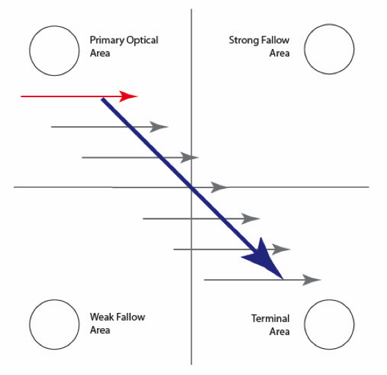
The pattern suggests that our eyes fall naturally to the top left corner of a page (or layout), and then sweep down the page moving left to right, line by line, until they reach the terminal area. This path (blue line) is referred to as reading gravity.
Given the diagonal reading gravity path from top left to bottom right, the Gutenberg diagram shows that the strong and weak fallow areas receive comparably little of the reader’s attention unless visually emphasised in some way.
Consequently, you should place important information along the reading gravity-path, as any design that forces the reader to work against reading gravity tends to destroy reading rhythm and reading comprehension.
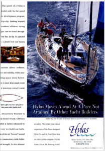
Consider the pictured Hylas Yacht ad – a full-page magazine spread in the January 2001 edition of Cruising World. This ad well and truly defies reading gravity, with the headline positioned three-quarters of the way down the page.
Since the headline is the natural starting point for reading a text, our eyes are immediately drawn to it, and we read that part first. Following the path of reading gravity, our eyes then track across and down, and we reach the logo of the yacht builder. The end….
What are the chances of readers now finding their way back to the top left-hand corner of the page and actually reading the ad? (Probably close to zero).
To avoid the body copy of your ad being completely disregarded by your readers, make sure your layout is in line with natural reading gravity…
That means, information appearing in the expected order, from left to right, top to bottom.
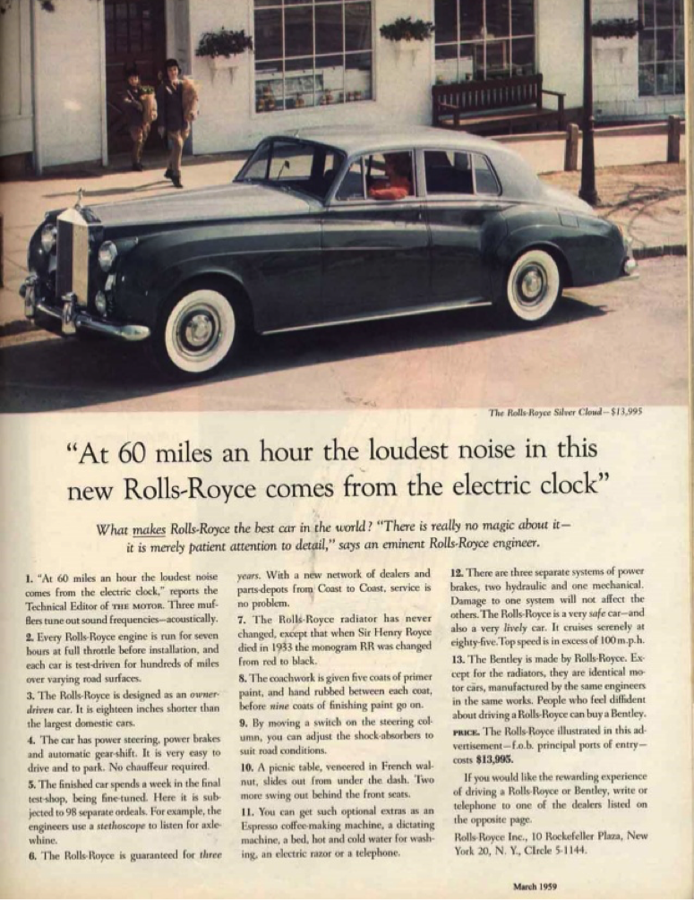
This Rolls Royce ad (Figure 3) is a classic example of excellent reading gravity. The eyes start by looking at the picture, which catches the reader’s attention. Next, they move down to the headline, which was carefully crafted by advertising mastermind David Ogilvy to pique the reader’s interest. From the headline, the eyes track down to the slightly smaller sub-headline, before moving on to three columns of easily legible body copy. The entire ad doesn’t feel like an ad, but more like a captivating story.
Compare this elegant and sophisticated ad (Figure 3) to the eye-assaulting ad pictured in figure 4. The ad in figure 4 fails to mention which store it’s actually advertising, and our eyes are torn trying to decide where to look first. Everything on the page is screaming at us in bold caps, and pieces of copy of similar size and impact are scattered left, right, and centre. The ad is exhausting to look at, let alone read, so it probably fails to get its message across to the reader.

The empirical research confirms what one would automatically assume when comparing the ads pictured in figures 2 -4: Comprehension of text with good reading gravity is double that of texts with poor reading gravity[1].
This is not surprising, as defying reading gravity means the reader has to put in extra effort, and that’s where many unconsciously get lost because they can’t (or don’t) muster the extra concentration necessary to go against their natural reading instincts.
That means, if you want your copy to be read, you have to put intentional effort into your design, to make sure it’s not costing you any of your potential readers. Remember, it’s your words that do the selling, so it should be your highest priority to make sure they get read.
Stay tuned for part two of our layout and design series, where we will discuss the impact of font style, size, and colour on your text’s readability.
[1] Wheildon, C. 2007. Type & Layout – Are you communicating or just making pretty shapes. Worsely Press.
If you want to build brand awareness, authority, and trust, your best bet is to start by nailing your brand story.
Whenever you are ready, there are 2 ways we can help you do that:
- Join The Storydriven Marketing Academy: Our FREE course that teaches you how to consistently nail your messaging across all brand assets
- Enquire about our Brand Storytelling Workshop: We work with you 1:1 over four guided workshop sessions to craft your storydriven brand messaging & content strategy